
Upgrade Your Website Before Googles Mobile-Friendly Update Kicks in on April 21
There are only a few days left until the April 2015 Google ranking factor kicks in. The impending update has led to quite a bit of confusion and this post might reduce that for you.
Let’s start with a simple fact: most websites today are designed to be responsive. Going back a few years, I can’t remember being involved with developing many websites that werent. However, you may still ask, “What does responsive really mean?
To state it simply, a responsive website design means your company’s website will look the same on any device, with some slight changes in rendering for screen width. So your website will look the same on a 4″ smartphone as it would on a 42” LED TV.
Most website designers today recognize this and build responsiveness into their design features. You should check to see if your website is responsive by navigating to this linkResponsive Design Checker.
Not having a responsive web design could be a huge mistake for any brand. A bad mobile experience gives your visitors a bad impression of your business. According to Compuware, 40 percent of visitors will go to a competitor if business websites dont offer a good mobile experience.
But this isn’t really what Google is focused on these days. For quite some time, Google has stated that “Content is King”. This is what the new search rankings will focus on, especially the mobile market. For Google, this means smartphones.
How many times have you conducted a search online only to find that images, videos, or links aren’t supported on your device? Google’s solution is to introduce a new ranking factor for these smartphones called “Mobile-Friendly”. You can see these words added to search results when using your smartphone.
Why is this important for your business? More than half of digital traffic now comes from mobile devices and through mobile apps. A comScore report from mid-2014 says smartphones and tablets combined now account for 60 percent of all online traffic, up from 50 percent in 2013. Is your business missing out?
Figure 1 is a screen shot of the top three websites for the mobile search “hair salons near me”.
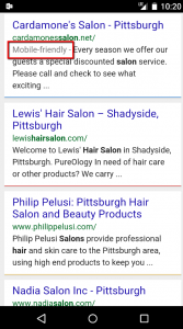
Figure 1 (Source: Google Search)
Only one of these three search results is listed as “Mobile-friendly”. This means that the content on the website will be available to any device. And this is what Google is trying to stress to business ownersmake sure you have content that is available to anyone, at any time, and on any device.
No “Mobile-friendly” designation will hamper your ranking on Google’s search results page beginning on April 21, 2015. Are you ready to lose up to 50% of your search results?
Check to see if your website is Mobile-friendly by visiting Google’s Mobile Friendly Test website here.
A multi-screen strategy is a must to succeed with today’s tech-savvy and constantly connected consumers. Contact a web developer to make sure your website meets the content needs of all consumers. Remember that Content is King, and Google sees content as a major ranking factor.
Gratifica: Now is a good time to refresh your website and have it re-indexed. This could have an impact on where your website appears in the search engines results pages.
Comments
comments