In case you havent heard by now, recent web design news says that Googles new update favoring mobile responsive web design rolled out on April 21, 2015. This update is Googles response to the rising number of mobile device users who demand better performance on their handy mobile phones. This means that if your website is not optimized for mobile devices then chances are that you are going to lag behind in the search results. Even if your website is mobile optimized, you still have a lot of catching up to do to get your website up to speed.
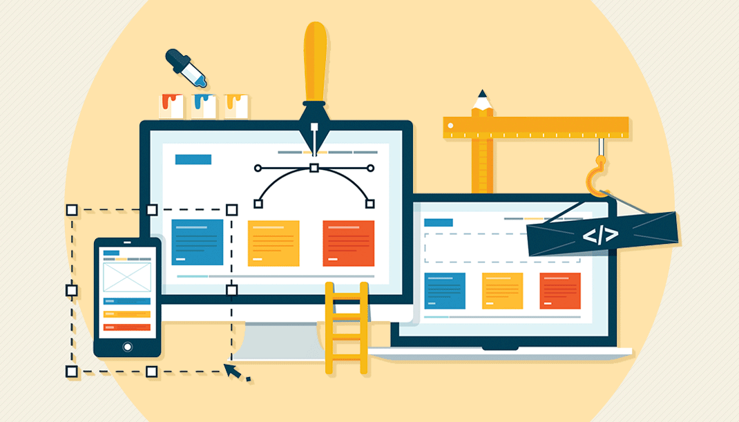
Think small, not big
In the past, flashy web design loaded with graphics was all the rage. Now, its all about being minimalistic and simple. This is timely and sensible; mobile devices are small and made to be carried around wherever one goes, and internet users dont want to browse complicated websites that take forever to load. Keep your web design clean and simple so that your site can easily fit in a smaller sized screen.
Make navigation easy
Mobile responsive design isnt all about design, per se. Its also about responsiveness. Your readers dont want to have to tap more than necessary or pinch their fingers just to see your content. According to an article on The Huffington Post (@HuffingtonPost) , you should design your website so that it makes navigating your site easier. Some useful web design tips for this endeavor include: use larger buttons, an appropriate color scheme and the right font size. You should also put the most relevant and important content at the top of your pages so that users wont have to scroll all the way down.
Appropriate content across devices
Not all your users use the same devices, which is why you need to track data to find out which devices are used commonly and how you can go about your web design. Save the features like interactive content and videos for the desktop version, and emphasize easy-to-read content like blog posts for mobile devices.
Include social media in design
Being on-the-go doesnt decrease your users desire to share content that they found very useful. WebDesignerDepot.com (@DesignerDepot) advises integrating social media buttons into your design. Place them where your users can easily see them. Not only will you satisfy your readers, you also get free exposure when they share your content.
Theres no doubt that mobile responsive design will yet again change the landscape. For more information on the points discussed, check out: The Importance of Responsive Design for New Websites and 6 Simple Rules for Designing Mobile Websites. If you want to keep your web design up to date, stay updated with the latest trends through news sites like Marketing Digest (@mktgdigest).
Comments
comments