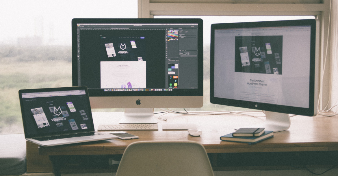
Like any field, web design is constantly evolving and going through trends. Currently, the winds are blowing toward more user-centric approaches that optimize the experience of your target audience and customers. The success of your website and the message its trying to deliver rests upon these user experiences.
Here are some web design trends were seeing in 2017 into 2018.
Conversational UI
Conversational user interfaces and their potential for use by companies have been brewing for a while now. More and more businesses and services are coming around to ideas on how to use these natural language interfaces to engage their website visitors.
The appeal is clear your prospects and customers want to be able to get help and answers to questions at their convenience while still feeling like theyre talking to someone sentient on the other end. Messaging platforms such as Slack and Facebook Messenger are starting to be incorporated into many websites to fulfill this growing demand.
Less and Less Becoming More
Minimalistic designs have always been considered sleek and modern, though often at the expense of user experience. Now minimalist design for websites has found a way to get the sleek and modern look while satisfying the user, namely through the use of Cards.
Users are presented with visually enticing entry points that act as gateways to more information – these are called Cards.
An excellent example of Cards in action is the Netflix interface, where multiple images of shows serve as Cards that present more information on the show when clicked on. Organizing the information on your website in this way lends itself to a de-cluttered, simplistic, and visually aesthetic design that users respond positively to.
Navigation Made Easy(ier)
No one likes a confusing and disorganized navigator, which is why designers have always aimed at making navigation simple, easy to learn, and until now, involving some kind of physical contact such as clicking, tapping, or swiping.
With the rise of digital voice assistants like Amazons Alexa, Windows Cortana, and of course, Apples Siri, the landscape of how users interact with digital navigation is changing on a base level. More and more designers are thinking of ways to incorporate voice recognition technology into navigation as we move toward a future of digital assistants with ever-growing linguistic capabilities. Navigation in relation to rapidly growing user interface technologies is a sector of design ripe with possibilities.
Real Images or None At All
For a while, stock photos were the way to go when wanting to relate visual imagery to the story, culture, or feel or your company/website. Certainly, stock images still have their use, however nowadays, especially among tech companies, real images inspire a more authentic feel to your website and business overall.
Real people are behind your company, show them off! Authenticity holds a lot of value in an age where real connections are harder to come by. By using personalized imagery specific to your company, youll inspire that connection with your target audience.
It doesnt have to be just images of your team either – other kinds of illustrations lend themselves, as long theyre unique to your company and reflect your brand, lends to an authentic feel as well. They are an excellent way to explain ideas and get your message across.
Keep it Moving with Animations/Cinemagraphs
Since their inception, people have always been captivated by moving pictures. This is still the case in 2017 and beyond. Using GIFs, animation, and cinemagraphs is a good way to captivate your audience. This is because still pictures and words wont always do alone.
Your cinemagraphs should always serve a purpose that ties into the larger message and goal of your site. Too many moving things for the sake of having them move can be overwhelming, but a well-placed looped video or animated graphics can go a long way in portraying the best things about your business in a pleasantly engaging way.
Big and Bold
Big, bold typography is making a splash on many web pages across the net. Typography fell by the wayside in the designer consciousness for a while, but now 2018 is saying bye to timid typefaces and hello to multicolored words taking up the majority of the screen and as a result, the majority of your audiences attention.
Not only does this big bold typography up the wow factor of your site, but it also serves as an effective way to communicate information on one page as well as organize sections into a hierarchy that gives priority to the things you want visitors to see first. As with many of the things on this list, design should not only serve aesthetics but function as well – typography is no different. Go big and go bold!
Enthusiastic Colors
When being boxed into the safe, comforting (and now considered corporate) designs of sites like twitter and facebook, designers started looking for ways to add personality to their designs in a way that made pages stand out while still maintaining style and functionality. Naturally, the outcome was the use of bold, gradient colors and bright natural hues that make pages and everything on them pop with a fresh, enthusiastic feeling.
These outstanding colors combined with equally bold typography is bringing forth a wave of websites bursting with personality and style. Now more than ever, designers are experimenting with colors in a way that we hope to see continuing beyond 2017.
As 2018 quickly approaches, web design keeps evolving based on user experience optimization. Fresh new ideas on how to put together a web page are constantly being put to the test, so dont get comfortable with any single approach for too long and expect it to stay fresh. Always be on the lookout for web design trends beyond 2017 and keep those site visitors coming.
Tips to Continuously Optimize your Website
To keep up with upcoming trends, first make sure to know your audience, do your research! Once you have the base knowledge of who youre catering to, test different strategies for your landing pages, images, forms, CTAs, etc. by doing A/B split tests. This will help highlight what works and what doesnt, and you can use that information to rethink the structure and navigation of your site. Make sure to test your newly restructured website for insights into how its being received by users, and tailor the actions users can take on your site to be as effortless as possible for them. These strategies incorporated with the latest design trends will spell out success for your site, attracting visitors and spreading your message!
Comments
comments