Landing Pages Aren’t Converting? Harness the Power of Conversion Centered Design
Previous posts on Marketing Digest have discussed subdisciplines of inbound marketing, such as closed-loop marketing and landing page optimization. This article will focus on conversion centered design, and highlights the essential elements that constitute high converting landing pages.
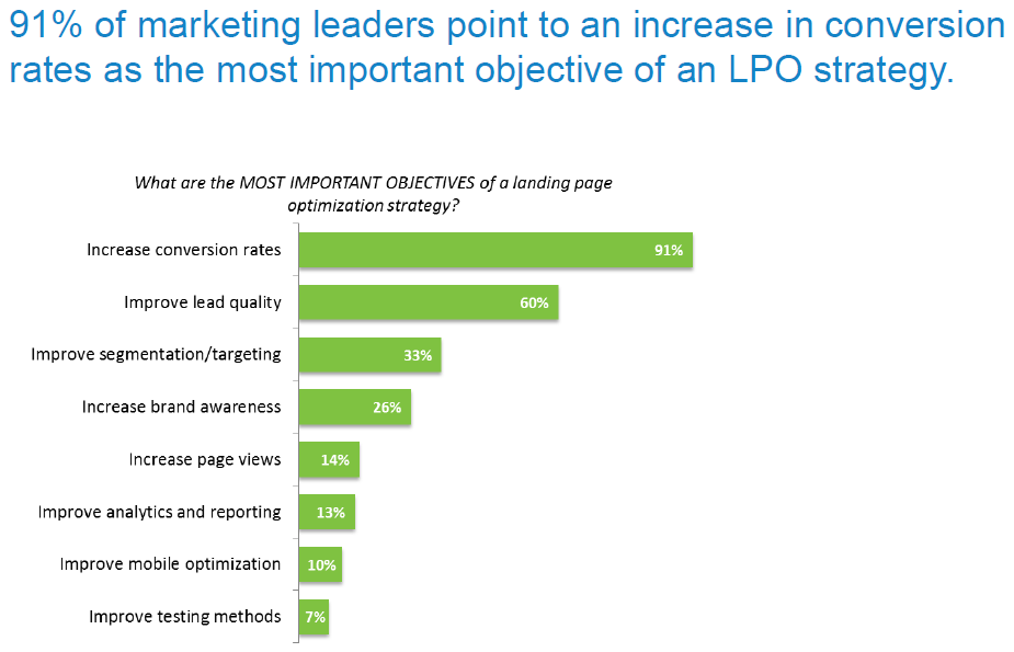
According to a recent report released by research-based demand generation company, Ascend2 (@Ascend2research), 91% of marketing leaders consider an increase in conversion rates to be the most important objective of their LPO (landing page optimization) strategy. In second and third place, 60% of marketing leaders consider an improvement in lead quality and 33% of marketing leaders consider an improvement in segmentation/targeting as the most important objectives of their LPO strategies. [See Figure 1]
Why is conversion such a central objective to most LPO strategies? According to a new study published by Hubspot and Unbounce (@HubSpot and @unbounce), entitled Conversion Centered Design: Essential Elements of High Converting Landing Pages, for marketers “conversion means convincing a visitor to do one thing and one thing only. Not one of many things, not accomplishing it in under seven seconds, not successfully navigating from one point to another — just completing a single business-driven objective.”
The aforementioned study also made a distinction between user centered design and conversion centered design (UCD and CCD). While both intertwine, the study noted that it was conversion that distinguished CCD from UCD.
Landing Pages Sit at the Heart of Conversion Centered Design
Conversion centered design is specifically targeted at crafting experiences that achieve a single business goal, and seeks to guide visitors towards completing that one specific action. To achieve this objective, psychological triggers and persuasive design are harnessed. In contrast UCD is more focused on the usability of a website or product information.
“Landing pages sit at the heart of CCD,” states the study. Landing pages work to convince visitors—who might have clicked on email links, display banners, or paid search ads—to convert on the spot, as opposed to the typical self-guided exploration that can be found on a website.
Landing pages are optimized using the “less is more” principle. A landing page that has been optimized for conversions will contain less links (or leaks). For example, a typical homepage functions as a central navigation portal, and allows site visitors to focus on multiple elements with competing objectives.
A lead generation landing page, on the other hand, functions best when visitors are encouraged to perform one action—such as filling out the form and clicking the CTA button to complete the conversion. “This produces a much more focused experience for visitors,” notes the report.
Avoid “Analysis Paralysis” by Limiting Conversion Goals
Research has revealed that when consumers are faced with too many choices, they’re less likely to purchase anything at all, and if they do, are less satisfied with their selections.
As demonstrated in the so-called “jam study,” psychologists Sheena Iyengar and Mark Lepper set up an experiment. On the first day, shoppers at a food market saw a display table with 24 varieties of jam. On another day, shoppers saw a similar table, only this time there were six varieties of jam. While the larger display attracted more attention from shoppers, when it came to finalizing purchases, people who were exposed to the larger display were one-tenth as likely to buy as people who saw the smaller display.
In other words, an overwhelming number of choices leads to a phenomenon known as “analysis paralysis”. Paradoxically, presenting too many options decreases the chances that people will make a choice. The same principal of lessening options can boost conversions on a landing page.
An experiment conducted by Unbounce in 2013 supports this hypothesis. Unbounce compared the conversion rates on two different versions of the same landing page. The first version offered customers four options for the upcoming demo sessions they could register to attend, whereas the second version offered customers three options for the upcoming demo sessions. [See Figure 2]
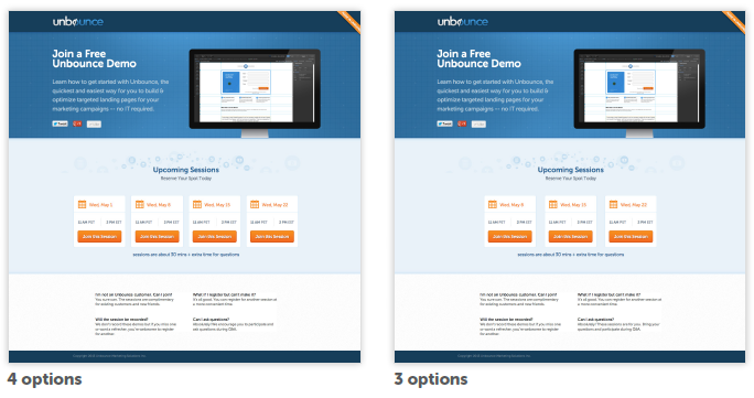
Figure 2 (Source: Hubspot and Unbounce’s “Conversion Centered Design: Essential Elements of High Converting Landing Pages”)
Unbounce then compared the conversion rates on both versions of the landing page. Not surprisingly, there was a 78% conversion lift for the landing page with three options. It’s clear from such studies that landing pages that are limited to a handful of conversion goals are more effective at generating conversions.
Lead Generation Landing Pages & Click Through Landing Pages
There are two main types of landing pages: lead generation landing pages and click through landing pages.
Lead generation landing pages are used to capture user data, and the only purpose of such pages is to capture information that will allow marketers to connect with leads at another time.
Lead generation landing pages also contain a description of what the visitor will receive (the incentive) in return for giving out their personal data. Some examples of incentives that marketers can use to obtain lead capture data include:
- eBooks and whitepapers
- Webinar registrations
- Discount coupons/vouchers
- Contest entries
- Free trials
- Consultation for professional services
- Physical gifts (sent via direct mail)
- Notifications of future product launches
“The length of your form and the level of personal data requested can have a direct impact
on conversion,” states the report. To increase conversions, marketers should ask for the minimum amount of information necessary that would enable them to market their services to leads effectively. As Figure 3 shows, once leads submit their contact information and click the CTA to receive their incentive, they’ll normally receive a confirmation via email/phone etc.

Figure 3 (Source: Hubspot and Unbounce’s “Conversion Centered Design: Essential Elements of High Converting Landing Pages”)
Click through landing pages encourage visitors to click through to another page, and are typically used in e-commerce funnels. Click through landing pages can be used to describe a product or service, or offer sufficient details to warm up visitors, tipping them closer to the point where they’re ready to make a purchase decision.
Marketers can incorporate click through landing pages into their e-commerce funnels to boost conversions. In contrast, poor conversions often result when inbound advertising traffic is sent directly to a homepage or registration page. “Registration pages don’t provide sufficient information for someone to make an informed decision, and homepages provide too many options. This is where the click through landing page comes in,” notes the report.
When the lead clicks through to the destination page, they’re armed with the information they’ll need to make an informed decision, and will be much more likely to buy. [See Figure 4]
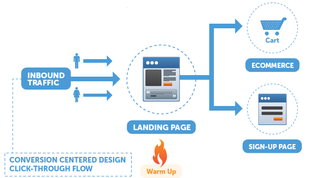
Figure 4 (Source: Hubspot and Unbounce’s “Conversion Centered Design: Essential Elements of High Converting Landing Pages”)
Advanced Segmentation: Create a Landing Page for Each Inbound Marketing Channel
Creating landing pages for different inbound marketing channels (such as social media, email, PPC, organic search, and display advertising), offers two key benefits. First, advanced landing page segmentation leads to higher conversion rates, as the message found on each landing page can be tweaked to target traffic from each inbound channel.
Second, advanced landing page segmentation can optimize the overall inbound marketing strategy, as it enables marketers to test channels against one another, helping them determine which channels to optimize and which to terminate.
Figure 5 shows dedicated landing pages for the various inbound marketing channels. These landing pages are connected to one ad.
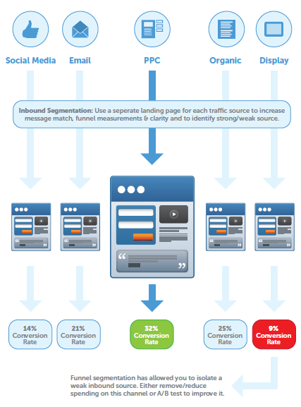
Figure 5 (Source: Hubspot and Unbounce’s “Conversion Centered Design: Essential Elements of High Converting Landing Pages”)
Do you have dedicated landing pages for each inbound marketing channel? Have you been able to boost your conversion rate using this tactic?
Marketing Digest Writing Team
Latest posts by Marketing Digest Writing Team (see all)
- How Taco Bell Struck Gold with Its Memorable Viral Marketing Campaigns - September 15, 2015
- Salesforce Marketing Cloud Releases New Instagram Marketing Tools - September 12, 2015
- Chrome Begins Pausing Flash Ads by Default to Improve User Experience - September 3, 2015

