Capture and Convert Like a Boss: Hot Tips That Will Help You Build Effective Landing Pages
You might have the best marketing strategy in the world that encompasses organic search, pay per click, and social media marketing, but if you don’t create effective landing pages, all the targeted traffic you’ve managed to drive to your website simply won’t convert. Indeed, an effective landing page is the cornerstone of any successful digital marketing campaign.
A landing page—also known as a “lead capture page” or “lander”—is a web page that appears after the searcher clicks on a search engine optimized search result, email link, online advertisement, or some other targeted campaign. The landing page often displays directed sales copy that is a logical extension of the ad, search result, or link.
Many marketers further narrow the definition of a landing page to mean any page on the web that has a form, and exists solely to capture pertinent information from the visitor through the form. While your homepage might be brimming with different elements, an effective landing page should serve just one clear objective—such as turning a site visitor into a lead (by capturing their vital information) or closing a deal.
On the other hand, what does an effective landing page look like and what does it do?
-
Effective Landing Pages Have Prominent and Well-Crafted UVPs
Creating an effective landing page isn’t easy. A badly conceived and ineffective landing page will rarely be visited and won’t convert optimally. By extension, a well-conceived and highly effective landing page will see many visits and will enjoy optimal conversions.
On average, you’ll have just eight seconds to grab your visitor’s attention. In light of this time constraint, you’ll need to present your visitor a well-crafted UVP (unique value proposition). A well-crafted UVP is a succinct and compelling message that highlights the characteristics that make your brand unique. A well-crafted UVP also differentiates your products/services from those of your competitors.
Listed below are some of the features that you want your visitor to understand (in eight seconds or less):
- What can the visitor get from you and how will you benefit them? You’ll need to talk about what every visitor cares most about—themselves and their problems.
- Is your landing page better or worse than the others the visitor has encountered? A great UVP stands out and communicates clearly. Your landing page needs to be a cut above the rest.
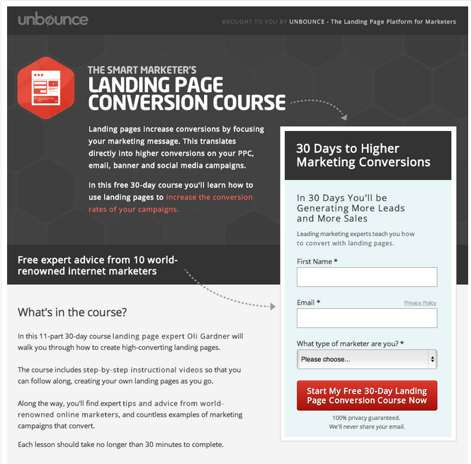
Figure 1 shows a particularly effective landing page from Unbounce (@unbounce). HubSpot (@HubSpot) praised this landing page for “1) The directional cues from the headline and browser’s fold, and 2) the really detailed information below the form.”
The directional cues from the headline and browser’s fold help draw attention to the objective of the page, which is to get the visitor to fill out the form. Meanwhile, the detailed information below the form gives this landing page an SEO boost, as it gives search engines more content to crawl.
The screenshot of the entire landing page can be found here.
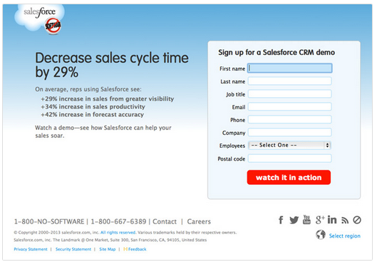
Those who’re looking for an example of an effective landing page with one clear objective should check out Salesforce’s (@salesforce) landing page. KISSmetrics (@KISSmetrics) praised Salesforce’s landing page, calling it “admirably restrained. [See Figure 2]
There’s no navigation bar up top, the few administrative links are tucked away at the bottom, and social links are small and discreetly grayed out. The form asks for just a few fields and follows up with a nice, bright, benefit-offering CTA.
It often takes many iterations to craft the perfect UVP for a landing page. Don’t be afraid to test different versions to see which one delivers the best results.
-
Effective Landing Pages Encourage Visitors to Complete an Action
As effective landing pages serve one clear objective (which is to get visitors to perform a desired action, such as signing up for a subscription or webinar; leaving their contact information; downloading a report, eBook, or video; or requesting a demo), careful attention needs to be paid to the “call to action” or CTA. When carefully crafted, the CTA will compel the visitor to perform the desired action.
It’s generally not recommended to have more than one CTA on a landing page. Remember, the golden rule is “one objective/CTA per landing page”. Add too many CTAs and competing objectives to your landing pages and your visitor will get confused. Here are other golden rules to observe:
- CTAs should showcase the only action the visitor can take on the landing page (which means no menus or links that could take them elsewhere).
- Great CTAs stand out. Try using high contrast, bright colors, and the strategic placement of CTAs on the landing page to see what works best.
- CTAs should harness dynamic verbs (ex: sign up, download) to get the desired action.
-
An Effective Landing Page Addresses any Objections the Visitor Might Have
In a traditional sales conversation, the sales representative answers each of the prospect’s objections with well-timed rebuttals. An effective landing page is a lot like a great sales conversation, as it addresses any objections the site visitor might have and awakens their desire to complete the desired action (which could be to purchase a product or service).
The challenge with using landing pages is that visitors cannot communicate their objections as they would in a sales conversation. Fortunately, you have three options for dealing with this challenge.
- Option 1: Address the Visitor’s Objections Upfront
To do this right, you’ll need to brainstorm any objections your landing page visitor might have. If they’re worried about the financial risks, justify how your product/service will deliver great ROI. If they’re worried that your product/service might not be the right fit for their needs, provide product features, FAQs, demos, or a free trial.
If they think your competitors might have a better offer, help them understand why you and your product/service is the best fit for their needs. There are innumerable objections. Discover which ones are particular to your target market and craft your rebuttals as needed.
- Option 2: Provide the Visitor a Channel to Provide Feedback or Ask Questions
Some landing page visitors would rather have their questions addressed directly, or may have a unique scenario that your landing page’s content cannot answer. Hence, you must make it easier for such visitors to provide you feedback or ask questions. You could set up a live chat, or use a service that lets you integrate feedback forms and surveys right into your website.
- Option 3: When all Else Fails, Give them a Risk-Free Money Back Guarantee
-
An Effective Landing Gives Something to Get Something in Return
Most landing pages are designed to convert visitors into leads. In the age of content marketing, companies often give visitors a free piece of content—such as an eBook, a webinar, or a report—in exchange for vital contact details. Hence, the CTA should explicitly drive the visitor to acquire the content.
Providing free content is usually part of a greater content marketing strategy. Getting landing page visitors to sign up for a newsletter, or getting their contact details in exchange for free high-quality content, will help you nurture those leads and drive them down the conversion funnel.
What other features and characteristics do effective landing pages possess?
Marketing Digest Writing Team
Latest posts by Marketing Digest Writing Team (see all)
- How Taco Bell Struck Gold with Its Memorable Viral Marketing Campaigns - September 15, 2015
- Salesforce Marketing Cloud Releases New Instagram Marketing Tools - September 12, 2015
- Chrome Begins Pausing Flash Ads by Default to Improve User Experience - September 3, 2015


