Almost a Month after Google Moves Under Alphabet Inc., the Tech Giant Unveils its New Logo
Once upon a time (the late 90’s to be exact), netizens in search of online information could only access Google from one device: their desktop PCs. Google has since expanded its suite of digital services, and is now accessible through an array of devices, ranging from mobile phones and TVs, to watches and the dashboards of automobiles. Google products can also be accessed through a variety of platforms and apps, making them an indispensable part of modern life.
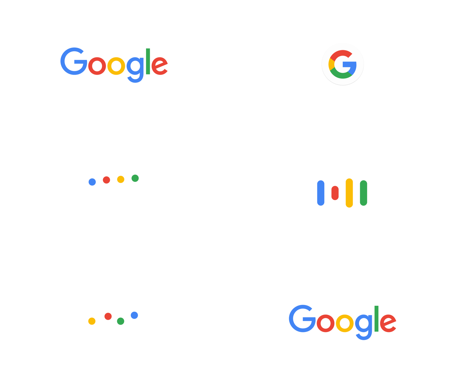
To celebrate its continued preeminence in the mobile age, Google has just released a whole new logo and identity family. “As you’ll see, we’ve taken the Google logo and branding, which were originally built for a single desktop browser page, and updated them for a world of seamless computing across an endless number of devices and different kinds of inputs (such as tap, type and talk),” noted Tamar Yehoshua, Vice President of Product Management, and Bobby Nath, Director of User Experience, in the official Google announcement.
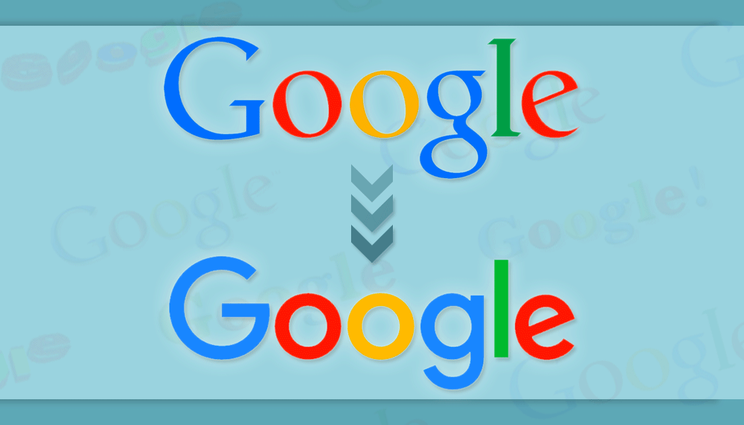
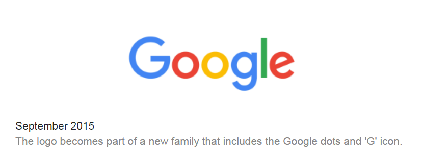
The latest iteration of the Google logo retains the traditional blue, red, yellow, and green hues; though a rounder sans-serif font has replaced the previous font. A large “G” featuring all four colors has also replaced the little blue “g” icon. [See Figure 1]
This is the sixth time Google has revamped its iconic logo. “This isn’t the first time we’ve changed our look and it probably won’t be the last, but we think today’s update is a great reflection of all the ways Google works for you across Search, Maps, Gmail, Chrome and many others.”
Check out the following video to learn more about the evolution of Google and its products:
Video 1 (Source: Google)
Google’s revamped logo was released almost a month after its co-founders, Larry Page and Sergey Brin, announced that Google would become part of a holding company called Alphabet, Inc. Under this new arrangement, Google and several other companies that were owned by or tied to Google, would be directly owned by Alphabet, Inc.
Alphabet Inc. has its own distinct logo and branding, of course, and some commentators have interpreted Google’s latest logo revamp as an acknowledgement that it has entered a new phase in its development.
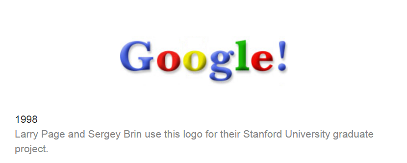
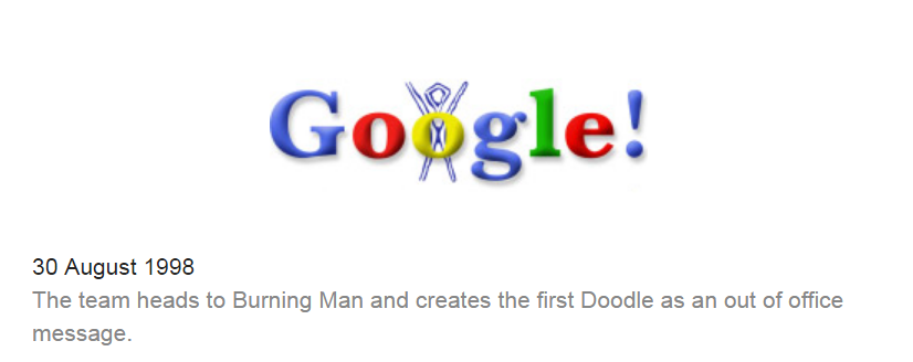
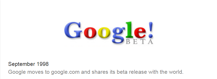
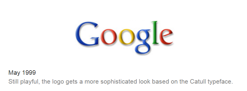
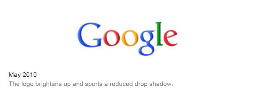
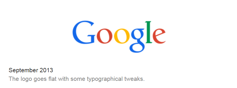
The following images show the evolution of the Google logo:
Marketing Digest Writing Team
Latest posts by Marketing Digest Writing Team (see all)
- How Taco Bell Struck Gold with Its Memorable Viral Marketing Campaigns - September 15, 2015
- Salesforce Marketing Cloud Releases New Instagram Marketing Tools - September 12, 2015
- Chrome Begins Pausing Flash Ads by Default to Improve User Experience - September 3, 2015

